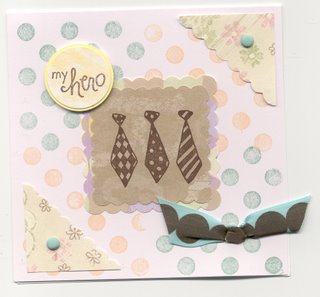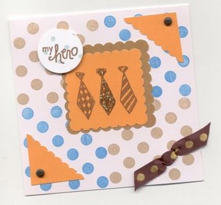

I don't often repeat myself. But sometimes, when I find I've stamped what I think is a great card, I try it in different colors and see what happens. I like both these cards. I like the pale peach/mint combo because it reminds me of the 70s but so does the orange and brown combo. I remember my dad coming home one day exclaiming he loved the orange and brown uniforms from Burger King (sometime in the 80s). At the time, he was looking for something a little bit different for his staff's uniforms. You guessed it, they got orange and brown. I think they were still wearing those colors 20 years later.
(stamps & notecards by A Muse)

1 comment:
Oh, wow! I love 'em. The first one is my favorite. That's a great idea to try. It would probably help me grow a little in my stamping...
Post a Comment